November 15, 2017, 7:40 am
ExpressQuantumPackMaintenance release includes several bug fixes.
Fixes
ExpressEditors Library
- cxImage - Invoking the context menu doesn't fire the OnContextPopup event.
- In-place cxRichEdit - The form's scaling factor multiplies the font size of the editor's unformatted text twice.
- TcxDBImage - AV when loading invalid images.
ExpressLayout Control
- Dragging a hidden empty group causes an AV.
ExpressSpreadSheet
- An AV occurs when loading a malformed XLS file if it contains two or more data entries for a cell.
- Export to HTML - The "Duplicates not allowed" exception occurs on exporting a worksheet containing a merged cell with a hyperlink.
- Loading shared formulas from an XLS file doesn't limit their column indexes to 256 as per specifications.
- Wrong image aspect ratio.
↧
November 15, 2017, 7:50 am
Webinar - What’s New in Infragistics Ultimate 17.2Webinar - What’s New in Infragistics Ultimate 17.2
Date: Nov 20, 2017 Event Timing: 11:00 AM
Event Description
Infragistics Ultimate UI 17.2 is loaded with productivity tools and fast-performing UI controls for quickly building web, desktop, and mobile apps. Join SVP of Developer Tools Jason Beres and the Infragistics Product Team for the launch webinar, where they’ll give you an inside look at what's new in this release, including:
- 30+ True Angular UI Components in the new Ignite UI for Angular component set.
- Quick Start JavaScript projects with new CLI & new Grid, Chart, and Schedule features.
- New Control Configurators, Royal Light Theme, & Scatter Series in WPF.
- New Windows Forms data visualization controls, including Category and Funnel Charts, new Bullet Graph, Linear Gauge, and Sparkline controls.
- New Charts, Schedule improvements, and Configurators in Xamarin.
- Sketch Integration and On-Premise Server for the rapid prototyping tool, Indigo Studio, and more.
Sign up today to attend the interactive, demo-driven webinar led by Infragistics Experts.
↧
↧
November 15, 2017, 2:40 am
Chart Configurator.Includes new chart types, Control Configurators, and improvements to the Data Chart and Scheduler.
Features
- New Charts - Two new chart controls have been added to Infragistics Ultimate UI for Xamarin that provide new options for data visualization: the xamDoughnutChart and the xamFunnelChart. The Doughnut Chart displays multiple data series using concentric rings, with slices that can be easily labeled or left unlabeled within each ring. The Funnel Chart displays diminishing values of a single series in a funnel shape with a variable number of sections that total 100 percent. It’s especially good for showing quantitative data in relation to the stages of a process.
- New QR Barcode - With the Quick Response (QR) barcode control, you can create a 2-D barcode matrix code that can be read by QR scanners and smartphones. The barcode is a square pattern made up of black square modules, with a unique finder pattern at three of the corners.
- New Control Configurators - Visually configure controls quickly and easily with no coding required. Use pre-built styles and WYSIWYG property editing to customize your controls and bind data directly from XAML files, then generate code with the click of a button. Control Configurators are available for six controls: Category Chart, Pie Chart, Bullet Graph, Linear Gauge, Radial Gauge, and Data Grid.
- Improvements to Data Chart - The Xamarin Data Grid now features column grouping with sticky headers, enabling you to organize data hierarchically based on matching property values. You can apply grouping to multiple columns to fine-tune your sorting and display.
- Improvements to Scheduler - Added a Day View and a Week View to the Scheduler. The Day View presents the hours of the day vertically, with activities arranged horizontally in configurable timeslots. The Week View has the same features as the Day View, but displays activities for all days in a particular week.
↧
November 16, 2017, 8:24 am
ComponentOne Ultimate.Updates C1 WinForms, WPF, UWP, ASP.NET MVC, Xamarin and Wijmo with new controls, charts, themes and demos.
Features
Updates in ComponentOne Studio WinForms
- New Expression Editor control allows end users to add Excel-like functions within a grid.
- FlexChart
- Added 16 chart types, including step chart variations, histogram, and ranged histogram.
- Added legend-grouping, drilldown support, line styling for markers and editable annotations.
- SaveImage is now available in FlexPie, Sunburst, and TreeMap charts.
- New Dashboard Demo showcases FlexChart, linear gauge, FlexGrid, range navigator, FlexPivot, map, and funnel chart controls.
- Added new financial chart type 'PointAndFigure'.
- Office 2016 themes have been added to WinForms Themes:
- Colorful
- DarkGrey
- Black
- White
- C1.Win.C1Chart - Added additional C1.Win.C1Chart.Legend methods to allow mouse tracking of trendline and function legend entries.
- C1.Win.C1Command
- Added new value "Control" into ButtonLookFlags enum. C1CommandLink border and background will not be drawn when ButtonLook == ButtonLookFlags.Control.
- Added themed glyphs for expand/collapse button in C1TopicBar control.
- Added ResizingMode property to C1DockingManager.
- Added Resizing and Resize events to C1DockingManager. Can be used to cancel resizing of a C1DockingTab by a splitter.
- Added C1NavBar.Style.Button.MoreButtonImage property.
- FlexReport - Added methods to C1TextSearchManager:
- C1FoundPosition FindStart(int startPageIndex, SearchScope scope, C1FindTextParams findParams).
- IAsyncOperationWithProgress FindStartAsyncEx(int startPageIndex, SearchScope scope, C1FindTextParams findParams, bool throwException).
- Task FindStartAsync(int startPageIndex, SearchScope scope, C1FindTextParams findParams, bool throwException).
- SearchScope enumeration specifies text search scope.
- WholeDocument: Searches to the end of the document.
- FirstOccurrence: Searches till the first occurrence is found.
- SinglePage: Searches within the specified page only.
- FlexReport - The following methods and classes were added to the C1.Win.C1Document, C1.Win.FlexReport to support the addition of the C1FlexViewer.HyperlinkJump event:
- C1LinkTargetBase and its descendants: Defines a link to another document or position in the same document.
- C1Hyperlink: Represents hyperlink.
- C1DocumentAction, SSRSOpenReportAction, SSRSToggleItemAction, SSRSSortAction: Defines an action that can be executed by the C1DocumentSource. This action can be specified for C1LinkTarget to execute before navigating.
- C1DocumentSource.ExecuteAction(C1DocumentAction) method: Executes specified action.
- C1.Win.C1FlexGrid
- Added export of images to Excel files using C1.Win.C1FlexGrid.ImportExport assembly.
- Added integration with C1ExpressionEditor control.
- Added Expression property to C1.Win.C1FlexGrid.Column.
- Added AllowEditingExpression property to C1.Win.C1FlexGrid.Column.
- C1.Win.C1GanttView - Added theme support for scrollbars.
- C1.Win.C1Ribbon - Added new RibbonAppMenuTab component for RibbonAppMenu. This component can host a Control.
- C1.Win.C1Schedule
- Default DateTime format for C1Schedule's title has been changed from 'MMMM d, yyy' to standard long date pattern 'D'.
- Default DateTime format for day headers in Day/WorkWeek/Week views has been changed from 'MMM d' to standard month/day pattern 'M'.
- The default value for VisualStyle property has been changed to System.
- Honor TimeRuler's Padding when drawing hour/minute lines in the vertical time ruler.
- Added PaletteType.Office2016 and PaletteType.Office2016Dark palettes to use with Office2013 and Office2016 themes.
- Added new PaletteOffice2016 class.
- Added new GroupTabStyle enum and corresponding property of the C1ScheduleTheme class which allow to choose between rectangular, Office2007 and Office2016 group tabs.
- Added new WeekTabStyle enum and corresponding property of the C1ScheduleTheme class which allow to choose between Office2007 and Office2016 week tabs.
- Improved selection of contrast foreground color if it is not good enough for selected palette.
- Added new Office 2016 themes.
- Added theme support for scrollbars.
- Allow to show up to 10 weeks in the MonthView.
- C1.Win.C1Themes
- Added C1CalendarView/Theme/Titles/Today property.
- Changed the title background color of Office2016Colorful and Office2016DarkGray themes. Changed the title font color of app menu of Office2016Colorful theme.
- Added C1DockingTab\Tabs\ShowFocusCues property.
- Added Page/ExpandGlyph and Page/CollapseGlyph properties to C1Command/C1TopicBar theme template.
- Adjusted Tabs appearance in C1DockingTab.
- Removed obsolete themes: VisualStyleOffice2010Black, VisualStyleOffice2010Blue, VisualStyleOffice2010Silver. Use Office2010XXX theme instead.
- C1.Win.C1TrueDBGrid
- Added Expression property to C1.Win.C1TrueDBGrid.C1DataColumn.
- Added AllowEditingExpression property to C1.Win.C1TrueDBGrid.C1DataColumn.
- Added support of integration with C1ExpressionEditor.
- C1.Win.Calendar
- Added Theme.Titles.Today property to customize the appearance of today's caption.
- Added new "SelectionRule" property which determines the behavior of SelectedDates during navigation.
- C1.Win.FlexViewer
- Added the LimitSearchToCurrentPage property indicating whether the text search should be limited to current page.
- Added the SearchOnCurrentPage element to C1FlexViewer.SearchBarElements with Visible = False by default.
- ZoomFactor property is now zooming from center of the control at runtime.
- C1.Win.TreeView
- Added new constructor to the C1TreeColumn class. This constructor contains the DisplayFieldName property as argument.
- Added new method Add to the C1TreeColumnCollection class. This method contains the HeaderText property as argument.
- Added support custom images for expand buttons and checkboxes. Added new CheckStateImageList and ButtonStateImageList properties.
Updates in ComponentOne Studio ASP.NET MVC Edition
- Added server-side TreeMap control for ASP.NET 4.0 and ASP.NET Core.
- New LearnMVC Client sample tutorials teach the basics of the client-side framework in the context of ASP.NET MVC, and you can also delve deeper into each control to learn its architecture and example APIs. Tutorials include:
- CollectionView
- FlexGrid
- FlexChart
- Input
- TreeView
- Project Templates updated for ASP.NET Core 2.0
- Model Binding
- AJAX Binding
- SpreadSheet
- The Project Template Gallery has also been created to better organize all templates.
- Improved accessibility, ARIA 1.1 built-in support added to:
- FlexGrid
- TreeView
- Gauge
- ListBox
- ComboBox
- Menu
- Client Side API Improvements
- FlexGrid - Added two new properties to improve FlexGrid keyboard accessibility: keyActionTab and keyActionEnter. These properties allow you to customize the behavior of special keys so the grid becomes more accessible or more compatible with Excel.
- FlexGrid - Added a new FlexGrid.itemValidator property to improve validation support, especially for unbound grids (bound grids can be validated using the CollectionView.getError property which provides the same functionality).
- Calendar - Added several new properties to make the Calendar control more customizable: formatYearMonth, formatDayHeaders, formatDays, formatYear, and formatMonths. All these properties represent format strings used to format different parts of the Calendar in month and year view.
- Calendar - Added time zone offset date format parts ('z', 'zz', 'zzz') to Globalize.formatDate.
- Popup - Made Popup ignore Escape key while IME mode is active.
- Popup - Added a Popup.removeOnHide property to control whether the Popup should be removed from the DOM or just hidden when the popup closes.
- ReportViewer - Hide the Parameters tab if all parameters are hidden.
- MultiSelect - Added a MultiSelect.selectAllLabel property to customize the label shown next to the "Select All" checkbox displayed when the showSelectAllCheckbox property is set to true.
- MultiSelect - Added a MultiSelect.showSelectAllCheckbox property to display a "Select All" checkbox above the items, so users can select/de-select all items with a single click (in addition to the ctrl+A keyboard shortcut that performs the same function).
- OLAP - Added some configuration properties to the wijmo.olap.PivotEngine class: serverTimeOut: the timeout value for retrieving results from the server, serverPollInterval: the poll interval for getting progress reports from the server, serverMaxDetail: the maximum number of detail records to retrieve from the server.
- CollectionView - Add forceRefresh method in RemoteCollectionView. This method is useful in case when DisableServerRead is true but changes need to be sent to server.
- CollectionView - Improved DateTime processing and added OnClientReponseTextParsing and OnClientRequestDataStringifying client side events to make explicit transformations. Read more.
Updates in ComponentOne Studio WPF and UWP
- New Expression Editor control allows end users to add Excel-like functions within a grid.
- FlexChart has added 16 chart types, including step chart variations, histogram, and ranged histogram. In addition, legend-grouping, drilldown support,and line styling for markers have been added as enhancements, and editable annotations are available as a sample. SaveImage is now available in FlexPie, Sunburst, and TreeMap charts.
- New Dashboard Demo showcases FlexChart, linear gauge, FlexGrid, range navigator, FlexPivot, map, and funnel chart controls.
- Added new financial chart type 'PointAndFigure'.
Updates in ComponentOne Studio for Xamarin
- New Sunburst chart - The hierarchical sunburst chart is now available across all FlexChart platforms.
- New project templates for Xamarin.Forms, X.iOS and X.Android make starting new projects significantly easier by cutting down the amount of code required before users can interact with controls. The templates come preloaded with NuGet packages and CustomRenderers already initialized.
- New Xamarin C1Weather sample uses OpenWeatherMap API to pull data to display in chart and grid.
Updates in Wijmo
- Added Intellisense support for Wijmo Angular components in VSCode HTML editor.
- Added React support for all Wijmo controls.
- FlexGrid now supports touch column and row resizing on touch devices.
- Major performance enhancement for FlexGrid: Added a quickAutoSize property which can improve auto-sizing performance by a factor of 10 to 100, depending on the scenario/browser.
- Added new AccessilityExtender for FlexGrid sample. It implements a class that provides additional accessibility support to FlexGrid controls.
- Improved (ARIA attributes and keyboard support) for the ListBox, ComboBox, Menu, InputNumber, Gauge, and Calendar controls.
- Added support for Angular version 5.0.0.
- Added 27 new Angular samples (ported from AngularJS).
- Improvements in InputNumber's editing experience.
- Improved popup positioning on mobile devices with pinch-zooming (including Android and IOS).
- Added support of cell text wrapping in FlexGrid.
- Added search capability to LearnWijmo along with many more lessons.
- Added UndoStack sample that demonstrates how to create a class that provides form-level undo/redo services.
- Added new financial chart type 'PointAndFigure'.
↧
November 16, 2017, 8:24 am
C1 Expression Editor control.Adds new Expression Editor control to C1 WinForms, WPF and UWP.
Features
Updates in ComponentOne Studio WinForms
- New Expression Editor control allows end users to add Excel-like functions within a grid.
- FlexChart
- Added 16 chart types, including step chart variations, histogram, and ranged histogram.
- Added legend-grouping, drilldown support, line styling for markers and editable annotations.
- SaveImage is now available in FlexPie, Sunburst, and TreeMap charts.
- New Dashboard Demo showcases FlexChart, linear gauge, FlexGrid, range navigator, FlexPivot, map, and funnel chart controls.
- Added new financial chart type 'PointAndFigure'.
- Office 2016 themes have been added to WinForms Themes:
- Colorful
- DarkGrey
- Black
- White
- C1.Win.C1Chart - Added additional C1.Win.C1Chart.Legend methods to allow mouse tracking of trendline and function legend entries.
- C1.Win.C1Command
- Added new value "Control" into ButtonLookFlags enum. C1CommandLink border and background will not be drawn when ButtonLook == ButtonLookFlags.Control.
- Added themed glyphs for expand/collapse button in C1TopicBar control.
- Added ResizingMode property to C1DockingManager.
- Added Resizing and Resize events to C1DockingManager. Can be used to cancel resizing of a C1DockingTab by a splitter.
- Added C1NavBar.Style.Button.MoreButtonImage property.
- FlexReport - Added methods to C1TextSearchManager:
- C1FoundPosition FindStart(int startPageIndex, SearchScope scope, C1FindTextParams findParams).
- IAsyncOperationWithProgress FindStartAsyncEx(int startPageIndex, SearchScope scope, C1FindTextParams findParams, bool throwException).
- Task FindStartAsync(int startPageIndex, SearchScope scope, C1FindTextParams findParams, bool throwException).
- SearchScope enumeration specifies text search scope.
- WholeDocument: Searches to the end of the document.
- FirstOccurrence: Searches till the first occurrence is found.
- SinglePage: Searches within the specified page only.
- FlexReport - The following methods and classes were added to the C1.Win.C1Document, C1.Win.FlexReport to support the addition of the C1FlexViewer.HyperlinkJump event:
- C1LinkTargetBase and its descendants: Defines a link to another document or position in the same document.
- C1Hyperlink: Represents hyperlink.
- C1DocumentAction, SSRSOpenReportAction, SSRSToggleItemAction, SSRSSortAction: Defines an action that can be executed by the C1DocumentSource. This action can be specified for C1LinkTarget to execute before navigating.
- C1DocumentSource.ExecuteAction(C1DocumentAction) method: Executes specified action.
- C1.Win.C1FlexGrid
- Added export of images to Excel files using C1.Win.C1FlexGrid.ImportExport assembly.
- Added integration with C1ExpressionEditor control.
- Added Expression property to C1.Win.C1FlexGrid.Column.
- Added AllowEditingExpression property to C1.Win.C1FlexGrid.Column.
- C1.Win.C1GanttView - Added theme support for scrollbars.
- C1.Win.C1Ribbon - Added new RibbonAppMenuTab component for RibbonAppMenu. This component can host a Control.
- C1.Win.C1Schedule
- Default DateTime format for C1Schedule's title has been changed from 'MMMM d, yyy' to standard long date pattern 'D'.
- Default DateTime format for day headers in Day/WorkWeek/Week views has been changed from 'MMM d' to standard month/day pattern 'M'.
- The default value for VisualStyle property has been changed to System.
- Honor TimeRuler's Padding when drawing hour/minute lines in the vertical time ruler.
- Added PaletteType.Office2016 and PaletteType.Office2016Dark palettes to use with Office2013 and Office2016 themes.
- Added new PaletteOffice2016 class.
- Added new GroupTabStyle enum and corresponding property of the C1ScheduleTheme class which allow to choose between rectangular, Office2007 and Office2016 group tabs.
- Added new WeekTabStyle enum and corresponding property of the C1ScheduleTheme class which allow to choose between Office2007 and Office2016 week tabs.
- Improved selection of contrast foreground color if it is not good enough for selected palette.
- Added new Office 2016 themes.
- Added theme support for scrollbars.
- Allow to show up to 10 weeks in the MonthView.
- C1.Win.C1Themes
- Added C1CalendarView/Theme/Titles/Today property.
- Changed the title background color of Office2016Colorful and Office2016DarkGray themes. Changed the title font color of app menu of Office2016Colorful theme.
- Added C1DockingTab\Tabs\ShowFocusCues property.
- Added Page/ExpandGlyph and Page/CollapseGlyph properties to C1Command/C1TopicBar theme template.
- Adjusted Tabs appearance in C1DockingTab.
- Removed obsolete themes: VisualStyleOffice2010Black, VisualStyleOffice2010Blue, VisualStyleOffice2010Silver. Use Office2010XXX theme instead.
- C1.Win.C1TrueDBGrid
- Added Expression property to C1.Win.C1TrueDBGrid.C1DataColumn.
- Added AllowEditingExpression property to C1.Win.C1TrueDBGrid.C1DataColumn.
- Added support of integration with C1ExpressionEditor.
- C1.Win.Calendar
- Added Theme.Titles.Today property to customize the appearance of today's caption.
- Added new "SelectionRule" property which determines the behavior of SelectedDates during navigation.
- C1.Win.FlexViewer
- Added the LimitSearchToCurrentPage property indicating whether the text search should be limited to current page.
- Added the SearchOnCurrentPage element to C1FlexViewer.SearchBarElements with Visible = False by default.
- ZoomFactor property is now zooming from center of the control at runtime.
- C1.Win.TreeView
- Added new constructor to the C1TreeColumn class. This constructor contains the DisplayFieldName property as argument.
- Added new method Add to the C1TreeColumnCollection class. This method contains the HeaderText property as argument.
- Added support custom images for expand buttons and checkboxes. Added new CheckStateImageList and ButtonStateImageList properties.
Updates in ComponentOne Studio ASP.NET MVC Edition
- Added server-side TreeMap control for ASP.NET 4.0 and ASP.NET Core.
- New LearnMVC Client sample tutorials teach the basics of the client-side framework in the context of ASP.NET MVC, and you can also delve deeper into each control to learn its architecture and example APIs. Tutorials include:
- CollectionView
- FlexGrid
- FlexChart
- Input
- TreeView
- Project Templates updated for ASP.NET Core 2.0
- Model Binding
- AJAX Binding
- SpreadSheet
- The Project Template Gallery has also been created to better organize all templates.
- Improved accessibility, ARIA 1.1 built-in support added to:
- FlexGrid
- TreeView
- Gauge
- ListBox
- ComboBox
- Menu
- Client Side API Improvements
- FlexGrid - Added two new properties to improve FlexGrid keyboard accessibility: keyActionTab and keyActionEnter. These properties allow you to customize the behavior of special keys so the grid becomes more accessible or more compatible with Excel.
- FlexGrid - Added a new FlexGrid.itemValidator property to improve validation support, especially for unbound grids (bound grids can be validated using the CollectionView.getError property which provides the same functionality).
- Calendar - Added several new properties to make the Calendar control more customizable: formatYearMonth, formatDayHeaders, formatDays, formatYear, and formatMonths. All these properties represent format strings used to format different parts of the Calendar in month and year view.
- Calendar - Added time zone offset date format parts ('z', 'zz', 'zzz') to Globalize.formatDate.
- Popup - Made Popup ignore Escape key while IME mode is active.
- Popup - Added a Popup.removeOnHide property to control whether the Popup should be removed from the DOM or just hidden when the popup closes.
- ReportViewer - Hide the Parameters tab if all parameters are hidden.
- MultiSelect - Added a MultiSelect.selectAllLabel property to customize the label shown next to the "Select All" checkbox displayed when the showSelectAllCheckbox property is set to true.
- MultiSelect - Added a MultiSelect.showSelectAllCheckbox property to display a "Select All" checkbox above the items, so users can select/de-select all items with a single click (in addition to the ctrl+A keyboard shortcut that performs the same function).
- OLAP - Added some configuration properties to the wijmo.olap.PivotEngine class: serverTimeOut: the timeout value for retrieving results from the server, serverPollInterval: the poll interval for getting progress reports from the server, serverMaxDetail: the maximum number of detail records to retrieve from the server.
- CollectionView - Add forceRefresh method in RemoteCollectionView. This method is useful in case when DisableServerRead is true but changes need to be sent to server.
- CollectionView - Improved DateTime processing and added OnClientReponseTextParsing and OnClientRequestDataStringifying client side events to make explicit transformations. Read more.
Updates in ComponentOne Studio WPF and UWP
- New Expression Editor control allows end users to add Excel-like functions within a grid.
- FlexChart has added 16 chart types, including step chart variations, histogram, and ranged histogram. In addition, legend-grouping, drilldown support,and line styling for markers have been added as enhancements, and editable annotations are available as a sample. SaveImage is now available in FlexPie, Sunburst, and TreeMap charts.
- New Dashboard Demo showcases FlexChart, linear gauge, FlexGrid, range navigator, FlexPivot, map, and funnel chart controls.
- Added new financial chart type 'PointAndFigure'.
↧
↧
November 16, 2017, 8:24 am
New Starburst chart type added to C1 Studio Xamarin.Adds new project template for C1 Xamarin.Forms, X.iOS and X.Android.
Features
- New Sunburst chart - The hierarchical sunburst chart is now available across all FlexChart platforms.
- New project templates for Xamarin.Forms, X.iOS and X.Android make starting new projects significantly easier by cutting down the amount of code required before users can interact with controls. The templates come preloaded with NuGet packages and CustomRenderers already initialized.
- New Xamarin C1Weather sample uses OpenWeatherMap API to pull data to display in chart and grid.
↧
November 16, 2017, 8:24 am
New C1Weather sample added to C1 Xamarin.Android.Adds new Sunburst chart and project templates for Xamarin.Android.
Features
- New Sunburst chart - The hierarchical sunburst chart is now available across all FlexChart platforms.
- New project templates for Xamarin.Android make starting new projects significantly easier by cutting down the amount of code required before users can interact with controls. The templates come preloaded with NuGet packages and CustomRenderers already initialized.
- New Xamarin C1Weather sample uses OpenWeatherMap API to pull data to display in chart and grid.
↧
November 16, 2017, 8:24 am
New Starburst chart type added to C1 Xamarin.iOSAdds new Sunburst chart and project templates for Xamarin.iOS.
Features
- New Sunburst chart - The hierarchical sunburst chart is now available across all FlexChart platforms.
- New project templates for Xamarin.iOS make starting new projects significantly easier by cutting down the amount of code required before users can interact with controls. The templates come preloaded with NuGet packages and CustomRenderers already initialized.
- New Xamarin C1Weather sample uses OpenWeatherMap API to pull data to display in chart and grid.
↧
November 16, 2017, 8:24 am
New Office 2016 Themes in C1 WinForms.Adds new Expression Editor control and Office 2016 themes.
Features
- New Expression Editor control allows end users to add Excel-like functions within a grid.
- FlexChart
- Added 16 chart types, including step chart variations, histogram, and ranged histogram.
- Added legend-grouping, drilldown support, line styling for markers and editable annotations.
- SaveImage is now available in FlexPie, Sunburst, and TreeMap charts.
- New Dashboard Demo showcases FlexChart, linear gauge, FlexGrid, range navigator, FlexPivot, map, and funnel chart controls.
- Added new financial chart type 'PointAndFigure'.
- Office 2016 themes have been added to WinForms Themes:
- Colorful
- DarkGrey
- Black
- White
- C1.Win.C1Chart - Added additional C1.Win.C1Chart.Legend methods to allow mouse tracking of trendline and function legend entries.
- C1.Win.C1Command
- Added new value "Control" into ButtonLookFlags enum. C1CommandLink border and background will not be drawn when ButtonLook == ButtonLookFlags.Control.
- Added themed glyphs for expand/collapse button in C1TopicBar control.
- Added ResizingMode property to C1DockingManager.
- Added Resizing and Resize events to C1DockingManager. Can be used to cancel resizing of a C1DockingTab by a splitter.
- Added C1NavBar.Style.Button.MoreButtonImage property.
- FlexReport - Added methods to C1TextSearchManager:
- C1FoundPosition FindStart(int startPageIndex, SearchScope scope, C1FindTextParams findParams).
- IAsyncOperationWithProgress FindStartAsyncEx(int startPageIndex, SearchScope scope, C1FindTextParams findParams, bool throwException).
- Task FindStartAsync(int startPageIndex, SearchScope scope, C1FindTextParams findParams, bool throwException).
- SearchScope enumeration specifies text search scope.
- WholeDocument: Searches to the end of the document.
- FirstOccurrence: Searches till the first occurrence is found.
- SinglePage: Searches within the specified page only.
- FlexReport - The following methods and classes were added to the C1.Win.C1Document, C1.Win.FlexReport to support the addition of the C1FlexViewer.HyperlinkJump event:
- C1LinkTargetBase and its descendants: Defines a link to another document or position in the same document.
- C1Hyperlink: Represents hyperlink.
- C1DocumentAction, SSRSOpenReportAction, SSRSToggleItemAction, SSRSSortAction: Defines an action that can be executed by the C1DocumentSource. This action can be specified for C1LinkTarget to execute before navigating.
- C1DocumentSource.ExecuteAction(C1DocumentAction) method: Executes specified action.
- C1.Win.C1FlexGrid
- Added export of images to Excel files using C1.Win.C1FlexGrid.ImportExport assembly.
- Added integration with C1ExpressionEditor control.
- Added Expression property to C1.Win.C1FlexGrid.Column.
- Added AllowEditingExpression property to C1.Win.C1FlexGrid.Column.
- C1.Win.C1GanttView - Added theme support for scrollbars.
- C1.Win.C1Ribbon - Added new RibbonAppMenuTab component for RibbonAppMenu. This component can host a Control.
- C1.Win.C1Schedule
- Default DateTime format for C1Schedule's title has been changed from 'MMMM d, yyy' to standard long date pattern 'D'.
- Default DateTime format for day headers in Day/WorkWeek/Week views has been changed from 'MMM d' to standard month/day pattern 'M'.
- The default value for VisualStyle property has been changed to System.
- Honor TimeRuler's Padding when drawing hour/minute lines in the vertical time ruler.
- Added PaletteType.Office2016 and PaletteType.Office2016Dark palettes to use with Office2013 and Office2016 themes.
- Added new PaletteOffice2016 class.
- Added new GroupTabStyle enum and corresponding property of the C1ScheduleTheme class which allow to choose between rectangular, Office2007 and Office2016 group tabs.
- Added new WeekTabStyle enum and corresponding property of the C1ScheduleTheme class which allow to choose between Office2007 and Office2016 week tabs.
- Improved selection of contrast foreground color if it is not good enough for selected palette.
- Added new Office 2016 themes.
- Added theme support for scrollbars.
- Allow to show up to 10 weeks in the MonthView.
- C1.Win.C1Themes
- Added C1CalendarView/Theme/Titles/Today property.
- Changed the title background color of Office2016Colorful and Office2016DarkGray themes. Changed the title font color of app menu of Office2016Colorful theme.
- Added C1DockingTab\Tabs\ShowFocusCues property.
- Added Page/ExpandGlyph and Page/CollapseGlyph properties to C1Command/C1TopicBar theme template.
- Adjusted Tabs appearance in C1DockingTab.
- Removed obsolete themes: VisualStyleOffice2010Black, VisualStyleOffice2010Blue, VisualStyleOffice2010Silver. Use Office2010XXX theme instead.
- C1.Win.C1TrueDBGrid
- Added Expression property to C1.Win.C1TrueDBGrid.C1DataColumn.
- Added AllowEditingExpression property to C1.Win.C1TrueDBGrid.C1DataColumn.
- Added support of integration with C1ExpressionEditor.
- C1.Win.Calendar
- Added Theme.Titles.Today property to customize the appearance of today's caption.
- Added new "SelectionRule" property which determines the behavior of SelectedDates during navigation.
- C1.Win.FlexViewer
- Added the LimitSearchToCurrentPage property indicating whether the text search should be limited to current page.
- Added the SearchOnCurrentPage element to C1FlexViewer.SearchBarElements with Visible = False by default.
- ZoomFactor property is now zooming from center of the control at runtime.
- C1.Win.TreeView
- Added new constructor to the C1TreeColumn class. This constructor contains the DisplayFieldName property as argument.
- Added new method Add to the C1TreeColumnCollection class. This method contains the HeaderText property as argument.
- Added support custom images for expand buttons and checkboxes. Added new CheckStateImageList and ButtonStateImageList properties.
↧
↧
November 16, 2017, 8:24 am
C1 Expression Editor control.New Expression Editor control allows end users to add Excel-like functions within a grid.
Features
- New Expression Editor control allows end users to add Excel-like functions within a grid.
- FlexChart has added 16 chart types, including step chart variations, histogram, and ranged histogram. In addition, legend-grouping, drilldown support,and line styling for markers have been added as enhancements, and editable annotations are available as a sample. SaveImage is now available in FlexPie, Sunburst, and TreeMap charts.
- New Dashboard Demo showcases FlexChart, linear gauge, FlexGrid, range navigator, FlexPivot, map, and funnel chart controls.
- Added new financial chart type 'PointAndFigure'.
↧
November 16, 2017, 8:24 am
C1 Dashboard Demo.New Dashboard Demo showcases FlexChart, linear gauge, FlexGrid, range navigator, FlexPivot, map, and funnel chart controls.
Features
- New Expression Editor control allows end users to add Excel-like functions within a grid.
- FlexChart has added 16 chart types, including step chart variations, histogram, and ranged histogram. In addition, legend-grouping, drilldown support,and line styling for markers have been added as enhancements, and editable annotations are available as a sample. SaveImage is now available in FlexPie, Sunburst, and TreeMap charts.
- New Dashboard Demo showcases FlexChart, linear gauge, FlexGrid, range navigator, FlexPivot, map, and funnel chart controls.
- Added new financial chart type 'PointAndFigure'.
↧
November 16, 2017, 8:24 am
ASP.NET MVC TreeMap.Adds server-side TreeMap control for ASP.NET 4.0 and ASP.NET Core.
Features
- Added server-side TreeMap control for ASP.NET 4.0 and ASP.NET Core.
- New LearnMVC Client sample tutorials teach the basics of the client-side framework in the context of ASP.NET MVC, and you can also delve deeper into each control to learn its architecture and example APIs. Tutorials include:
- CollectionView
- FlexGrid
- FlexChart
- Input
- TreeView
- Project Templates updated for ASP.NET Core 2.0
- Model Binding
- AJAX Binding
- SpreadSheet
- The Project Template Gallery has also been created to better organize all templates.
- Improved accessibility, ARIA 1.1 built-in support added to:
- FlexGrid
- TreeView
- Gauge
- ListBox
- ComboBox
- Menu
- Client Side API Improvements
- FlexGrid - Added two new properties to improve FlexGrid keyboard accessibility: keyActionTab and keyActionEnter. These properties allow you to customize the behavior of special keys so the grid becomes more accessible or more compatible with Excel.
- FlexGrid - Added a new FlexGrid.itemValidator property to improve validation support, especially for unbound grids (bound grids can be validated using the CollectionView.getError property which provides the same functionality).
- Calendar - Added several new properties to make the Calendar control more customizable: formatYearMonth, formatDayHeaders, formatDays, formatYear, and formatMonths. All these properties represent format strings used to format different parts of the Calendar in month and year view.
- Calendar - Added time zone offset date format parts ('z', 'zz', 'zzz') to Globalize.formatDate.
- Popup - Made Popup ignore Escape key while IME mode is active.
- Popup - Added a Popup.removeOnHide property to control whether the Popup should be removed from the DOM or just hidden when the popup closes.
- ReportViewer - Hide the Parameters tab if all parameters are hidden.
- MultiSelect - Added a MultiSelect.selectAllLabel property to customize the label shown next to the "Select All" checkbox displayed when the showSelectAllCheckbox property is set to true.
- MultiSelect - Added a MultiSelect.showSelectAllCheckbox property to display a "Select All" checkbox above the items, so users can select/de-select all items with a single click (in addition to the ctrl+A keyboard shortcut that performs the same function).
- OLAP - Added some configuration properties to the wijmo.olap.PivotEngine class: serverTimeOut: the timeout value for retrieving results from the server, serverPollInterval: the poll interval for getting progress reports from the server, serverMaxDetail: the maximum number of detail records to retrieve from the server.
- CollectionView - Add forceRefresh method in RemoteCollectionView. This method is useful in case when DisableServerRead is true but changes need to be sent to server.
- CollectionView - Improved DateTime processing and added OnClientReponseTextParsing and OnClientRequestDataStringifying client side events to make explicit transformations. Read more.
↧
November 16, 2017, 8:24 am
New Undo/Redo Sample.FlexGrid now supports touch column and row resizing on touch devices, plus new Undo/Redo sample.
Features
- Added Intellisense support for Wijmo Angular components in VSCode HTML editor.
- Added React support for all Wijmo controls.
- FlexGrid now supports touch column and row resizing on touch devices.
- Major performance enhancement for FlexGrid: Added a quickAutoSize property which can improve auto-sizing performance by a factor of 10 to 100, depending on the scenario/browser.
- Added new AccessilityExtender for FlexGrid sample. It implements a class that provides additional accessibility support to FlexGrid controls.
- Improved (ARIA attributes and keyboard support) for the ListBox, ComboBox, Menu, InputNumber, Gauge, and Calendar controls.
- Added support for Angular version 5.0.0.
- Added 27 new Angular samples (ported from AngularJS).
- Improvements in InputNumber's editing experience.
- Improved popup positioning on mobile devices with pinch-zooming (including Android and IOS).
- Added support of cell text wrapping in FlexGrid.
- Added search capability to LearnWijmo along with many more lessons.
- Added UndoStack sample that demonstrates how to create a class that provides form-level undo/redo services.
- Added new financial chart type 'PointAndFigure'.
↧
↧
November 16, 2017, 8:24 am
Simple Reports in React Sample.Wijmo 5 renames to Wijmo Core, including FlexGrid performance enhancements and React support for all Wijmo controls.
Features
- Added Intellisense support for Wijmo Angular components in VSCode HTML editor.
- Added React support for all Wijmo controls.
- FlexGrid now supports touch column and row resizing on touch devices.
- Major performance enhancement for FlexGrid: Added a quickAutoSize property which can improve auto-sizing performance by a factor of 10 to 100, depending on the scenario/browser.
- Added new AccessilityExtender for FlexGrid sample. It implements a class that provides additional accessibility support to FlexGrid controls.
- Improved (ARIA attributes and keyboard support) for the ListBox, ComboBox, Menu, InputNumber, Gauge, and Calendar controls.
- Added support for Angular version 5.0.0.
- Added 27 new Angular samples (ported from AngularJS).
- Improvements in InputNumber's editing experience.
- Improved popup positioning on mobile devices with pinch-zooming (including Android and IOS).
- Added support of cell text wrapping in FlexGrid.
- Added search capability to LearnWijmo along with many more lessons.
- Added UndoStack sample that demonstrates how to create a class that provides form-level undo/redo services.
- Added new financial chart type 'PointAndFigure'.
↧
November 17, 2017, 2:08 am
Merged column grouping.Adds merged grid column grouping.
Features
- GridView Control
- Merged Column Grouping - With this release, you can now merge the Grid View's grouped columns by dragging appropriate column header(s) to the group panel and arranging them across a line.
- Data Export - You can now export data using built-in functionality and no longer need to use an external export engine. The new 'Export' command item can be added to the built-in toolbar without any code. In addition, it now supports export to DOCX.
- Adaptive Popup Dialogs - With this release, the DevExpress Data Grids ship with adaptive popup dialogs (header filter's dropdown, popup edit form, filter builder).
- Filtering UI Enhancements - You can now display the filter editor within the Header Filter's dropdown. Once you begin entering a search string, the dropdown item list is automatically updated with relevant/matching items.
- Chart Control
- Criteria Based Unified Filtering - With this release, the series DataFilter property has been replaced with the FilterCriteria and FilterString properties. This allows you to use the Filter Control to manage data represented within a chart.
- Totals Labels for Stacked Bars and Pies - With this release, the DevExpress Chart Control is shipped with the ability to calculate total labels for stacked bars and pies automatically. Bar total labels are labels that display series group total values and are outside groups.
- LegendTextPattern for a Series with the Disabled ColorEach Mode - Use the LegendTextPattern property to configure legend text for series using the disabled ColorEach mode. This feature helps you modify legend text without the need to handle CustomDrawSeries events.
- Display a Chart Using the SVG Format - DevExpress Charts for ASP.NET and MVC can now render a client-side chart as an SVG image.
- Export a Chart to an SVG Image - You can now export charts to a vector image file format (SVG).
- Dock and Popups
- Popup Control - Adaptivity - The DevExpress Popup for WebForms and MVC now supports an adaptive display mode. When used, its content is rearranged and adapted to any screen resolution. Fields are positioned one under another and are arranged within one column when the browser window changes its width.
- Editors
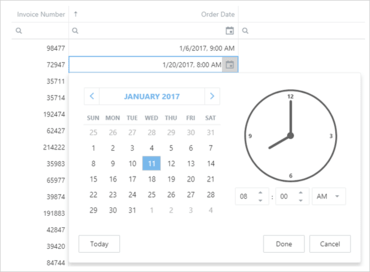
- Calendar and DateEdit - Inline Selection Mode - The ASP.NET Calendar and DateEdit controls now offer the inline mode for more efficient date navigation/selection. The control includes settings that allow you to control navigation depth and navigation button visibility.
- Check Box - Toggle Switch - The WebForms and MVC Check Box allows you to transform the default representation of a checkbox and display it as a toggle switch.
- Date Editor - Adaptivity - With this release, the DevExpress DateEdit Control for WebForms and MVC can adapt its content based on browser window size. When used, the time region moves below the calendar region within the control's dropdown.
- List Box - Select All - End-users can now select all ListBox items using the 'Select All' check box located at the top of the control.
- ListBox - Filtering - The DevExpress ASP.NET ListBox can now filter data. End-users can filter list box items by entering text into the filter editor located above the list. When entering a filter string, the item list is automatically updated so that the ListBox only displays relevant items (those that match the filter string).
- Client API Enhancements - The client API has been extended with new methods that allow you to detect changes on a form and notify users of the need to save/cancel changes before leaving the page.
- File Manager & File Upload
- Advanced Filtering - Extended the filtering capabilities of the DevExpress ASP.NET File Manager. You can now allow end-users to filter file manager items within the current folder and all subfolders. In addition, a new server-side API allows you to implement custom filters for the File View (when you need to implement filters to locate files by extension, modification time, etc.).
- Adaptivity - The DevExpress ASP.NET File Manager ships with a new adaptive mode. Once enabled, File Manager elements are automatically rearranged based upon browser size.
- HTML Editor
- Resizable Images and Tables - The DevExpress ASP.NET HTML Editor allows end-users to resize images and tables.
- Responsive Toolbars - In all toolbar modes (menu, ribbon, one-line ribbon), the DevExpress ASP.NET HTML Editor can automatically adapt its toolbar content depending on the viewport width.
- Navigation and Layout
- Menu - Adaptivity - Improved support for adaptive/responsive layouts.
- Pivot Grid Control
- Performance Enhancements - Improved the in-memory data processing capabilities of the DevExpress Pivot Grid Control for WebForms and MVC. Based on usage scenario, the control is up to 3 times faster than previous versions.
- Rich Editor Control
- Document Protection - The ASP.NET Rich Text Editor continues to extend its support for document protection. You can now specify permissions for a protected document in order to limit editing to a collection of users and user groups.
- Context Menu Customization - With this release, you can handle a new client-side event to customize the ASP.NET Rich Editor's context menu (insert new menu items, remove or disable existing items) or prevent the menu from being displayed.
- Improved Support for Scalable Environments (Clouds/WebGardens/WebFarms) - This features is available as a CTP (community technology preview). In previous versions, DevExpress ASP.NET Office-inspired controls (Spreadsheet, Rich Editor) maintained document states in memory. This offered the best performance, but affected scalability. With the new stateless option, you can maintain document state in external storage (Redis and SQL server support has been implemented, base code for other external storage medium is also available).
- New Public Client-Side Events - This release includes numerous new client-side events designed to enhance control over Editor behavior:
- Receive or lose focus.
- Switch the active sub-document.
- Modify content (inserting/removing).
- Change character or paragraph properties.
- Handle mouse and keyboard actions.
- Scheduler Control
- Scheduler - Adaptivity Enhancements - In this release, WebForms and MVC Scheduler provides improved support for a variety of screen resolutions. It also includes redesigned layout for the Appointment dialog in adaptive mode. The Agenda View is now fully adaptive (including the View Selector and View Visible Interval elements).
- Appointment Tooltip Presentation Modes - You can now specify the appointment tooltip mode - whether a tooltip is represented as a button or as a hint.
- New Dialog Customization API - A new server API enables you to work with default dialogs' view models (both declaratively and programmatically) and change dialog element characteristics (values, availability and layout) as needed, without the necessity of copying dialog form templates (UserControls) into your project.
- Reminder Dialog Enhancements - The DevExpress Scheduler's Reminders dialog has been improved. The dialog now provides detailed appointment information along with an 'Open Item' button.
- Touch UI Improvement - The Scheduler allows end-users to easily manipulate appointments on touch devices (dragging an appointment and extending/reducing the selection).
- Client API Enhancements - The DevExpress Scheduler's Client API has been extended with a number of new methods allowing to control the Resource Navigator and toolbar visibility, the control and scrollable area's height, and selection.
- Agenda View Enhancements - Extended the functionality of the DevExpress Scheduler’s AgendaView. You can now:
- Specify whether day headers are displayed vertically or horizontally. In adaptive mode, the Scheduler can automatically specify day header orientation mode based upon browser window width.
- Show or hide the Time section.
- Fix the day header while scrolling a long list of appointments.
- Control icon cell visibility.
- Spreadsheet Control
- Improved Support for Scalable Environments (Clouds/WebGardens/WebFarms) - This features is available as a CTP (community technology preview). In previous versions, DevExpress ASP.NET Office-inspired controls (Spreadsheet, Rich Editor) maintained document states in memory. This offered the best performance, but affected scalability. With the new stateless option, you can maintain document state in external storage (Redis and SQL server support has been implemented, base code for other external storage medium is also available).
- TreeList Control
- Full-Functional Filtering Support - Now equipped the DevExpress ASP.NET Tree List with filtering capabilities. End-users can filter Tree List data using the following UI elements:
- Auto-Filter Row
- Built-in Search Panel
- Column Header Filter Dropdowns
- Data Export - You can now export data using built-in functionality and no longer need to use an external export engine. The new 'Export' command item can be added to the built-in toolbar without any code. In addition, it now supports export to DOCX.
- Miscellaneous Enhancements
- The ability to change a column's display text. This option allows an end-user to sort/filter tree list data either by display text or value.
- Support for unbound columns that are not bound to any field in a data source. Data for this column type is calculated based on an expression or by using a specific event.
- Themes
- New Office 365 Theme - This release includes a new Office 365 theme for both desktop and touch-first devices.
↧
November 17, 2017, 2:52 am
Grid Column Chooser.Display, hide and rearrange grid columns at runtime.
Features
- Grid Control
- Column Chooser - The Windows 10 Grid Column Chooser allows end-users to display, hide and rearrange columns at runtime.
- Attributes-Based Validation - The DevExpress Windows10 Grid Control now supports DataAnnotations attributes.
- Alternating Row Styles
- Miscellaneous
- Master-Detail Pattern - This release includes a Master-Detail Pattern navigation layout. This feature allows you to replicate the look and feel of the Windows 10 Mail app within your application.
- Svg Icon Palettes - You can specify the global palette used to colorize SVG images in your application. In addition, you can apply a custom palette to individual icons and override the colors specified by the global palette.
↧
November 17, 2017, 3:10 am
Seamlessly connect a chart to Grid data at both design and runtime.Seamlessly connect a chart to Grid data at both design and runtime.
Features
- Data Grid Control
- DirectX Hardware Acceleration Support - The DevExpress WinForms Data Grid and WinForms Cell Editors can now use DirectX hardware acceleration, allowing you to deliver outstanding performance on high-DPI devices. To activate DirectX painting, call the static WindowsFormsSettings.ForceDirectXPaint method.
- Drag and Drop Manager for Data Grid and Tree List - v17.2 ships with an automatic drag-and-drop engine for both the WinForms Data Grid and Tree List control. With the new DragAndDropBehavior (part of the Behavior Manager), you can initiate drag-and-drop operations between the Data Grid, Tree List and ListBox controls in various combinations, with a few lines of code.
- Binding a Chart to Bound Controls (via the ControlRowsSource) - You can now seamlessly connect a chart to Grid data at both design and runtime.
- Grid-Based Lookup Edit - Render Lookup Records as Tiles or Modern Style Lists - In addition to standard grid formats, the WinForms Grid-based Lookup control allows you to render lookup records using an embedded TileView. The TileView (part of the WinForms Data Grid control) supports multiple data presentation formats, including: Default Tile Mode, Kanban and List.
- Clipboard Management: Pasting to the Grid and TreeList - This release extends the Data Grid and TreeList control's clipboard capabilities by adding support for paste operations. End-users can now copy data from Microsoft Excel, an external Data Grid or another source and then paste information directly into a target Data Grid/TreeList. Data can be added into existing cells or new rows appended.
- Excel Inspired Filtering Enhancements - The new PrepareTemplate and CustomizeTemplate events allow you to customize column filter dropdowns.
- Chart Control
- Unified Criteria-Based Filtering - With this release, the series DataFilter property has been replaced with the FilterCriteria and FilterString properties. This change allows you to use either the Filter Control or the new Filtering UI to manage data represented within a chart.
- Totals Labels for Stacked Bars and Pies - With this release, the DevExpress Chart Control is shipped with the ability to calculate total labels for stacked bars and pies automatically.
- Data Grid Integration - Added the capability to populate a chart with a Data Grid's data via the ControlRowSource control. ControlRowSource allows to specify which data grid rows should be visualized: selected, currently visible or all. Besides, you can use the Source to provide data to a Chart from a Vertical Grid and Tree List. The other major integration feature is the Grid's ability to display a Chart within its cell because since the last release the ChartControl implements the DevExpress.XtraEditors.CustomEditor.IAnyControlEdit interface.
- Qualitative Data Aggregation - With the 17.2 release, in addition to the numeric and date-time data aggregation, the Chart control obtains the ability to aggregate a series' data rows with the equal qualitative argument.
- Indicator Animation - The chart can animate the appearance of an indicator. Now all elements that depends on data can be animated on data changes.
- LegendTextPattern for a Series with the Disabled ColorEach Mode - With this release, the LegendTextPattern property allows you to configure legend text for a series using the disabled ColorEach mode. This feature helps you modify legend text without the need to handle CustomDrawSeries events.
- Export a Chart to an SVG image - You can now export charts to a vector image file format (SVG).
- Diagram Control
- Mind Map Layout - The new Mind Map automatic layout algorithm is used to create non-linear hierarchical diagrams arranged around a central idea or subject.
- Binding Behavior Enhancements - DevExpress Diagram's binding mechanism has been updated with the following new capabilities:
- Two-way synchronization between the diagram and the data source: You can customize synchronization using events.
- Binding to hierarchical data: Containers are now used to represent multiple levels of hierarchy.
- New Scrolling Mode - DevExpress Diagram ships with a new scrolling mode. When this mode is enabled, scrollbars are displayed only when diagram content is not fully visible (regardless of current page size).
- SVG Enhancements - DevExpress Diagram v17.2 ships with a new SVG rendering engine and features extended support for various SVG elements. In addition, you can now override the default colors used for bichromatic SVG images.
- API Enhancements - New Notification Events - Implemented new events that fire in response to various user actions.
- DPI Awareness
- DirectX Hardware Acceleration Support - The DevExpress WinForms Data Grid and WinForms Cell Editors can now use DirectX hardware acceleration, allowing you to deliver outstanding performance on high-DPI devices. To activate DirectX painting, call the static WindowsFormsSettings.ForceDirectXPaint method.
- DPI-aware Image Collection - Blurred icons are no longer an issue on Hi-DPI screens with the new DPIAwareImageCollection component. This component automatically provides images for linked controls based upon screen DPI settings. A built-in designer allows you to set up the component by adding DPI-specific versions of individual images.
- Editors
- Folder Browser and Open/Save File Dialogs (CTP) - This release introduces skinnable DevExpress counterparts for standard WinForms FolderBrowser and Open/Save File dialogs.
- New Magnifier Dialog - The Magnifier first intruduced in the WinForms Skin Editor is now available as a stand-alone tool. You can pick RGB or HEX colors from anywhere on the screen and save them to the clipboard.
- Updated Color Picker Dialog - This release includes a simplified color pick dialog for the Color Edit and Color Pick Edit editors.
- Simplified HTML in Data Grid, TreeList and Container Cells - With this release, we've made it much easier to display formatted text within Data Grid and Tree List cells. By embedding a new HypertextLabel in a cell, you can format data using simplified HTML syntax. As you might expect, you can change font and color attributes for all or a portion of the text, insert images, hyperlinks or line breaks as needed.
- List Box - Item Templates - Item templates are now available to all ListBox controls (ListBoxControl, ImageListBoxControl and CheckedListBoxControl). This new feature helps you render each listbox item as needs dictate. Each item can display multiple elements arranged in any manner, and painted using different appearance settings. A built-in designer helps you build a template with just a few mouse clicks. You can create any number of item templates and dynamically apply them to list box items when necessary.
- PDF Viewer
- Document Display Enhancements - The scaling factor specified in the operating system's display settings is used when a document is displayed on high DPI devices. The images below demonstrate the impact of this new feature. The zoom level of the PDF Viewer is set to 100%. The desktop scaling factor (greater than 100%) is set to 125% in the operating system's display settings. Note that the DPI-Aware option must be set to true in the application manifest.
- Text Markup Annotations - You can highlight, strikethrough or underline text using the corresponding tool in the WinForms PDF Viewer’s Comment toolbar. You can also select the text markup annotation, change its properties or delete the markup annotation from a document.
- Rendering Very Large Images - Large image rendering (unpacked size is 200+ Mb) is now supported.
- Pivot Grid Control
- Excel-inspired Filtering - Now supports Excel-inspired column filter popups for column and row fields.
- Performance Enhancements - This release includes significant enhancements to the in-memory data processing capabilities of the DevExpress Pivot Grid Control. It is now up to 2-5 times faster when compared to earlier versions.
- Intellisense Editor for Unbound Field Expressions - Now uses an Expression Editor for editing unbound field expressions.
- Support for SVG Icons - The Pivot Grid can now use vector SVG icons instead of bitmap images to help improve rendering on High-DPI displays.
- SVG Support - This release adds support for vector images.
- Skins
- New SVG Skin - v17.2 ships with a new WinForms skin (The Bezier) based entirely on SVG images, which allows the controls to look perfectly on any screen with any DPI settings. You can create new variations of this skin using the updated Skin Editor - without the need to rely upon a third-party graphics editor.
- Color Swatches - The Bezier is the first skin that ships with UI elements that allow users to instantly change the skin palette and re-paint a skin at runtime. You can easily create a custom palette to apply a corporate style to your application.
- SVG Icon Builder - A productivity tool designed to simplify the creation of custom SVG icons by combining graphical elements shipped as part of the Icon Library. Icons generated via the SVG Icon Builder fully support the DevExpress skin colorization feature.
- Snap
- Chart API - With this release, the data-aware RTF Control (Snap) allows you to create and modify charts in code.
- Spreadsheet Control
- Chart Sheets - With this release, DevExpress Spreadsheet for WinForms and WPF gives you the ability to place a chart on a separate worksheet by creating a chart sheet (view, edit or print the chart within its own page).
- TreeList Control
- Drag and Drop Manager for Data Grid and Tree List - v17.2 ships with an automatic drag-and-drop engine for both the WinForms Data Grid and Tree List control. With the new DragAndDropBehavior (part of the Behavior Manager), you can initiate drag-and-drop operations between the Data Grid, Tree List and ListBox controls in various combinations, with a few lines of code.
- Hierarchy Column - In previous versions, the TreeList's hierarchy column (the one that displays expand and collapse buttons) was always the first visible column. With this release, you can explicitly specify the hierarchy column for your TreeList. This allows you to move the column and its associated hierarchy information to any position.
- Miscellaneous Enhancements - This release includes numerous enhancements to the WinForms TreeList including:
- New TreeView Data Presentation Option: You can now emulate the appearance of the standard TreeView control (no column headers, no lines between rows, modified row highlighting style, etc) when displaying a single column of hierarchical data.
- High Performance Best Fit Option: The TreeList now offers a BestFitMode option - allowing you to select between its default (Full) and the new fast mode. The latter significantly improves rendering performance for large record sets.
- Auto-Fill Empty Space: With this release, you can force a column to automatically change width and populate any empty space within the TreeList's container.
- Loading Panel: You can now visually indicate the status of data loading processes.
- Ability to specify a column's maximum width (the 'MaxWidth' property).
- You can now indent/outdent individual TreeList nodes (new Indent and Outdent methods).
- In addition, the TreeList ships with options to custom paint entire nodes, ability to specify which mouse actions activate in-place editing (MouseDown, MouseUp, DoubleClick, etc.), and an improved design-time UX (including changes to the Designer, Nodes Editor and smart tags).
- Vertical Grid Control
- Vertical Grid - Data Filtering - End-users can filter data using filter dropdowns and the advanced Filter Editor. By default, the Excel-inspired filtering UI is active.
- Filtering
- Filtering UI Context Enhancements - Filtering UI Context component has been refined. Now, you can associate a target control (e.g., a Grid View or Chart Control) with a couple of clicks at design time and thereby instantly generate all the filtering UI editors required.
- Unified Criteria-Based Filtering - With this release, the filtering system becomes common across all grid controls (Data Grid, Property Grid, Pivot Grid and Vertical Grid) and uses a criteria-based language to define filters.
- Miscellaneous
- SVG Image Collection - In this release, DevExpress controls gain support for SVG vector icons. To store and provide these icons to controls, use the new SvgImageCollection. Like other image collections, it can be populated from local storage, form resources, DevExpress Image Gallery, or a project assembly.
- DPI-aware Image Collection - Blurred icons are no longer an issue on Hi-DPI screens with the new DPIAwareImageCollection component. This component automatically provides images for linked controls based upon screen DPI settings. A built-in designer allows you to set up the component by adding DPI-specific versions of individual images.
- Data Source Wizard Enhancements - The DevExpress WinForms Data Source Wizard ships with the following enhancements:
- Support for DevExpress Visual Studio Themes.
- Support for .Net Standard 2.0 data sources: EF Core 2.0+.
- Dashboards integration.
- Binding charts to data-aware list-controls.
- Appearance Object Editor - Using this dialog, you can now save appearances applied to one UI element and instantly share it across others.
- LayoutControl Enhancements - DevExpress WinForms Layout Tools (Layout Control and Data Layout Control) ship with a number of performance and usability enhancements:
- Data Layout Control: A new context menu allows you to change or assign a Binding to control at Design Time.
- Enhanced design-time performance during multiple item selection and property change operations.
- Ability to choose item navigation direction when using the TAB key: Across then down (default) or Down then across.
- New API (deleting items and disposing of their controls, moving individual items, updating a table layout, etc.)
- A Property Grid is now available in the Layout Control's Customization window at Design Time.
- Ability to edit the properties of hidden items at design and runtime.
- MVVM Enhancements - This release includes the following MVVM related enhancements for the WinForms product line:
- A new NavigationService that allows you to navigate between Views. Navigation history is stored automatically.
- The ViewModelCreate event includes a static version (available from the static MVVMContextCompositionRoot class). Both events can be handled to retrieve full-fledged ViewModel instances at runtime.
↧
↧
November 17, 2017, 3:24 am
New Hamburger Menu.Adds new Hamburger Menu and Scheduler controls.
Features
- New Hamburger Menu - The new DevExpress WPF Hamburger Menu can be used to emulate the navigation metaphor found in today's most popular web apps.
- New Scheduler Control - The new WPF Scheduler Control is better aligned with the core WPF principles and delivers improved performance.
- New Dialogs (CTP)
- Folder Browser and Open/Save File Dialogs - This release includes DevExpress counterparts to the following standard WPF dialogs: Open File Dialog, Save File Dialog and Folder Browser.
- Data Grid Control
- Performance Enhancements - This release includes significant enhancements to the text rendering. The WPF Grid Control can now render data rows up to 50% faster than its predecessor.
- Drag-and-Drop Enhancements - The DevExpress WPF Grid control ships with native drag-and-drop support and allows you to:
- Reorder records within all view types, including the Card View.
- Reorder records within Master-Detail Views.
- Move records outside the GridControl to external controls.
- Move records to and from external applications.
- Column Chooser Enhancements - The column chooser allows and-users to:
- Hide/display columns using checkboxes instead of dragging column headers.
- Reorder columns within the column chooser via drag and drop.
- Locate columns using built-in search.
- Manage band hierarchies.
- Master Detail Enhancements
- You can now display different detail records for different master rows.
- You can define custom margins for detail rows.
- The Grid allows you to store/restore detail views' layouts.
- Ability to hide Group Panels from detail views when they are not grouped.
- Compact Grid Mode - The WPF Data Grid can now dynamically adapt its content based upon control dimensions. In compact mode, the Grid displays a compact panel inspired by Microsoft Office that allows you to sort, group and filter records.
- New Expression Editor for Unbound Field Expressions - The DevExpress WPF GridControl ships with the Expression Editor with built-in AutoComplete support and syntax highlighting.
- Clipboard Management: Pasting to the Grid and TreeList - This release extends the Data Grid and TreeList control's clipboard capabilities by adding support for paste operations. End-users can now copy data from Microsoft Excel, an external Data Grid or another source and then paste information directly into a target Data Grid/TreeList. Data can be added into a new row or existing cells. New events have been introduced to help you dynamically customize or cancel certain paste operations.
- Miscellaneous Enhancements
- You can specify a column header image using the HeaderGlyph property.
- You can rearrange column header elements.
- A new AddingNewRow event allows you to initialize a newly added record.
- New CanSelectRow/CanUnselectRow and CanSelectCell/CanUnselectCell events to dynamically control row/cell selection.
- Export to DOCX.
- Accordion Control
- Accordion Collapse Mode - v17.2 ships with a customizable compact view.
- Accordion Item Customization - This release adds the following customization options to the WPF Accordion control:
- Item glyph can be displayed at top of text.
- New RootItemDisplayMode property allows you to enable a uniform style for root and subordinate items.
- New item Command property allows you to specify the command to be executed when an end-user clicks an item.
- Chart Control
- Criteria Based Unified Filtering - With this release, the series DataFilter property has been replaced with FilterCriteria and FilterString properties. This change allows you to use either the Filter Control or Data Layout Control to manage data represented within a chart.
- Chart Designer Enhancements - The WPF Chart Designer ships with the following new features:
- A layout/structure that is similar to the Chart Designer for WinForms.
- You can add, remove and hide chart elements via the structure tree.
- A new Options tab allows you to configure major chart element properties.
- A new Data tab helps you populate an individual series with data or populate a chart with series via series templates.
- Totals Labels for Stacked Bars and Pies - With this release, the DevExpress Chart Control allows you to calculate total labels for stacked bars and pies automatically.
- Range Control Integration
- Display or hide an individual series in the Range Control.
- Configure series representation (Line, Bar, Area) within the Range Control.
- Calculates the Range Control's grid automatically (based on the Chart's axis scale parameters).
- Scale Breaks - A chart's axis scale can now include scale breaks.
- Qualitative Data Aggregation - The WPF Chart control can now aggregate data with the equal qualitative argument.
- Bubble Series - Automatic Calculation Min and Max Sizes.
- Legend Enhancements
- Chart legend items can simultaneously display a marker and check box.
- BarSideBySideSeries2D - Display Series Point Labels for Zero Values
- The WPF Chart Control can now display series labels for zero values.
- LegendTextPattern for a Series with the Disabled ColorEach Mode
- Use the LegendTextPattern property to configure legend text for series using the disabled ColorEach mode. This feature helps you modify legend text without the need to handle CustomDrawSeries events.
- Extended MVVM Pattern Support
- The following chart elements can be generated from an item source using the item template:
- Panes
- Annotations
- Legends
- Custom legend items
- Strips
- Constant lines
- Indicators
- Diagram Control
- Mind Map Layout - The new Mind Map automatic layout algorithm is used to create non-linear hierarchical diagrams arranged around a central idea or subject.
- Binding Behavior Enhancements - DevExpress Diagram's binding mechanism has been updated with the following new capabilities:
- Two-way synchronization between the diagram and the data source: You can customize synchronization using events.
- Binding to hierarchical data: Containers are now used to represent multiple levels of hierarchy.
- New Scrolling Mode - DevExpress Diagram ships with a new scrolling mode. When this mode is enabled, scrollbars are displayed only when diagram content is not fully visible (regardless of current page size).
- SVG Enhancements - DevExpress Diagram v17.2 ships with a new SVG rendering engine and features extended support for various SVG elements. In addition, you can now override the default colors used for bichromatic SVG images.
- API Enhancements - New Notification Events - New events that fire in response to various user actions:
- Moving, copying and modifying diagram items.
- Changing shape connetors.
- Using diagram tools.
- Docking
- Miscellaneous Enhancements - The DefaultMenuItemNames class stores fields used to identify context menu items. The BaseLayoutItem.CloseCommand now provides a parameter.
- Map Control
- Theme Support - With this release, you can use the DevExpress WPF Theme Manager to control the WPF Map control's appearance.
- Circular Scrolling - The DevExpress WPF Map Control now supports circular scrolling.
- Legend Appearance Customization - Legend labels can now be customized using the Legend Item Label template.
- PDF Viewer
- Rendering Very Large Images - Large image rendering (unpacked size is 200+ Mb) is now supported.
- Text Markup Annotations - With this release, you can highlight, strikethrough or underline text using the corresponding tool in the viewer's Comment toolbar. You can also select the text markup annotation, change its properties or delete the markup annotation from a document.
- Pivot Grid Control
- Performance Enhancements - This release includes significant enhancements to the in-memory data processing capabilities of the DevExpress Pivot Grid Control. It is now up to 4 times faster than its predecessor.
- Intellisense Editor for Unbound Field Expressions - The DevExpress WPF Pivot Grid ships with an Expression Editor that supports auto completion and syntax highlighting.
- Rich Text Editor
- Context Menu Customization - With this release, the DevExpress WPF Rich Text Editor gives you the ability to customize its context menus. You can add or remove menu items by specifying necessary customization actions in XAML.
- MVVM Related Enhancements - The DevExpress WPF Rich Text Editor ships with the following MVVM related enhancements:
- All basic control properties (ActiveViewType, LayoutUnit, ReadOnly, etc.) are now bindable.
- RichEditSpellChecker behavior configuration is now available in the RichEditControl smart tag.
- UI Enhancements - The WPF Rich Text Editor v17.2 ships with the following new UI elements:
- Language, Table Styles, Bullets and Numbering and Table of Contents dialogs;
- Spell Checker
- Behavior Configuration - A Spell Checker Behavior has been added to the DevExpress WPF Rich Text Editor (RichEditSpellChecker) and to other supported text editors (DXSpellChecker). This feature allows you to configure spell-checking functionality in XAML and the corresponding control's smart tag.
- Spreadsheet Control
- Chart Sheets - With this release, DevExpress Spreadsheet allows to place a chart on a separate worksheet by creating a chart sheet (view, edit or print the chart within its own page).
- Miscellaneous Enhancements - The DevExpress WPF Spreadsheet ships with the following enhancements:
- Section 508 support.
- New Spreadsheet UI elements:
- Cell Styles, Chart Styles, Table Styles, and PivotTable Styles galleries.
- Change Chart Type and Print dialogs.
- Number Format and Border drop-down menus.
- Themes
- New WPF Themes - This release includes the following new themes:
- Office 2016 Black (SE).
- Visual Studio 2017 Dark.
- Visual Studio 2017 Blue.
- Visual Studio 2017 Light.
- WPF Theme Designer - The WPF Theme Designer allows you to easily create personalized themes for DevExpress WPF Controls. This release includes new instruments and improvements that simplify theme editing.
- Filter Colors - displays only the selected element's colors.
- Highlight Colors - highlights elements with the selected color on the preview.
- Color Picker - allows you to select a color from any application on screen.
- Color Wheel - a fast way to edit palette of a theme.
- 40+ new previews.
- TreeList Control
- Indent/Outdent Nodes - You can now indent/outdent individual TreeList nodes.
- Hierarchy Column Custom Position - The TreeListControl can display hierarchy column in any position, not only at the left side.
- Miscellaneous Enhancements
- Native drag-and-drop support.
- The new Column Chooser.
- Ability to automatically adapt content to control dimensions: compact mode.
- An autocomplete expression editor used to edit unbound column expressions.
- DOCX export.
- New events allow you to dynamically control whether an end-user can select or deselect nodes/cells.
- TreeMap Control
- WPF Theme Support - The DevExpress WPF ThemeManager can now control the appearance of the WPF TreeMap control.
- WPF Expression Editor - This release includes an updated WPF Expression Editor with built-in AutoComplete support, syntax highlighting and expression validation support.
- Miscellaneous Enhancements
- AppBar Control - AppBar now supports left and right alignment.
- Typed Styles - Typed styles provide a simplified way to define styles for standard and DevExpress controls.
- SVG Support in EnumItemsSource and EnumItemsSourceBehavior - With this release, you can specify the 'Image' attribute with SVG uri reference to EnumItemSource and EnumItemSourceBehaviour.
↧
November 17, 2017, 3:36 am
DateTime data type support.Search through grid header filter values.
Features
- New Color Schemes
- New Color Schemes for the Generic Theme - You can now change your entire application's color palette by applying one of the newly implemented schemes: Soft Blue, Carmine, Green Mist, Dark Violet, and Dark Moon. These new color schemes are based on the DevExtreme Generic theme.
- React Grid (Beta) - DevExtreme React Grid v17.2 ships with the following new features:
- Material UI Integration
- Column Reordering
- Column Resizing
- Keyboard Navigation
- Column Chooser
- Localization
- Data Formatting and Custom Data Accessors
- Data Grid
- Column Header Filter and Column Chooser Search - You can now search through header filter values. You can activate this feature for all columns or only a specific column using the widget's or column's 'headerFilter.allowSearch' option.
- DateTime Data Type Support - The HTML5 Data Grid fully supports time portions in Date-Time values:
- Proper time formatting is applied to cell display text.
- Cell drop-downs include time editing controls.
- The grid allows you to filter data while taking time values into account.
- Custom Sorting - You can implement your own value comparison function and thus enable custom data sorting algorithms.
- Data Visualization
- Funnel / Pyramid Chart - The new Funnel widget allows you to create funnel and pyramid charts for use within your HTML5-JavaScript applications.
- Chart Axis - Scale Breaks - DevExtreme HTML5-JavaScript Chart can automatically analyze your chart's data and apply scale breaks to improve readability. Manual scale breaks are also supported.
- Chart Axis - Tick Mark Generation - DevExpress HTML5 Chart v17.2 ships with improved tick mark generation logic:
- Date-time ticks are always displayed at the start of standard date-time intervals: first day of week / month / year, start of a day, top of an hour, etc.
- You can force a numeric axis to generate ticks only at whole number positions.
- Numeric and date-time axis can now automatically adjust label formatting, improving readability with a compact display option.
- Date-Time Axis - Exclude Weekends and Holidays - You can now suppress weekends and holidays on the chart's arguments scale and provide an uninterrupted display for a dataset that only includes work days.
- Pivot Grid
- Column Header Filter and Field Chooser Search Panel - With this release, the HTML5-JavaScript Pivot Grid can display a search box within its Field Chooser dialog and Filter Dropdown.
- Scheduler
- Display Multiple Days, Weeks, or Months in a View - The HTML5-JavaScript Scheduler allows you to specify the number of Days, Weeks or Months to display within the Day View, Week View and Month View respectively.
- Compressed Appointment Display Option - You can limit the number of simultaneously displayed appointments in:
- A single cell in the Month View.
- A single all-day panel in the Day View or Week View.
- Current Date-Time Indicator - The HTML5-JavaScript Scheduler can indicate the current time in views that utilize a time scale. In addition, you can enable timetable shading up to the current time mark.
- Tree List
- Recursive Node Selection - The HTML5-JavaScript Tree List now supports recursive node selection:
- When changing a parent node's selected state, all child nodes at all nesting levels are updated accordingly.
- Parent nodes can automatically change their state to selected, unselected or indeterminate, based upon the number of selected child nodes.
- Column Header Filter and Column Chooser Search - You can now search through header filter values. You can activate this feature for all columns or only a specific column using the widget's or column's 'headerFilter.allowSearch' option.
- UI Widgets
- New Filter Builder Widget - The new HTML5-JavaScript FilterBuilder widget allows users to construct complex filter expressions with absolute ease (supports an unlimited number of filter conditions). It can be used on a standalone basis or with the List, Data Grid, and TreeList widgets.
- TagBox - New Item Selection Options - The TagBox can now group multiple tags into a single label when all available tags are selected or when end-users select a predefined set. Users can access individual tags by clicking the joined label (invokes the dropdown selection list).
- DateBox and Calendar - Disable Desired Dates - The HTML5-JavaScript DateBox and Calendar widgets include a new disabledDates option. As the name suggests, this new feature allows you to disable access to certain dates within the calendar - by either supplying a predefined date array, or implementing a function that determines whether a date should be available to end-users.
- TreeView and List - Search Panel - To simplify record selection, the HTML5-JavaScript List and TreeView widgets allows you to display a search box within its container.
- NumberBox - Display Text Formatting and Input Masking - The NumberBox widget now supports flexible display text formatting using Locale Data Markup Language (LDML) patterns. The specified format can also be used as a mask to control end-user input.
- Improved Angular Support - This release includes the following Angular integration improvements:
- Optional jQuery Dependencies
- Disable jQuery dependencies and Increase Angular component performance by up to 30%.
- Improved TypeScript Declarations - All Angular component properties are now declared with a specific type instead of any. This helps avoid type conversion errors.
- Localization Enhancements
- LDML Pattern Support - With this release, you can use Locale Data Markup Language (LDML) patterns to localize dates and numbers regardless of the localization library used. Custom decimal and thousands separators The built-in localization engine now offers 'thousandsSeparator' and 'decimalSeparator' global configuration options.
- TypeScript Declarations
- Improvements - DevExtreme can now utilize the benefits of TypeScript 2.0 or higher and use specific types instead of any wherever possible.
- MVC Controls
- Data Layer - Consume API Controllers from a Different Domain - The 'newRemoteController()' method allows you to consume API controllers located in a different domain by URL.
- New Strongly-Typed HTML Helpers - You can now use lambdas when configuring Data Grid columns and summaries, PivotGrid fields, and Form items. This ensures compile-time type safety, enables IntelliSense, and automatically adds client-side validation based on Data Annotations defined in the model.
- Data Layer - Areas Support - You can now access API controllers in different areas using the 'Area()' method added to the 'Mvc()' data source.
- New NamedTemplate Helper for Creating Complex Views - This release introduces a new 'NamedTemplate()' helper - allowing you to embed controls into one another. By leveraging its capabilities, you can reduce the amount of code needed to generate complex views.
↧
November 17, 2017, 4:12 am
DevExpress DXperienceMajor enhancements for ASP.NET, WinForms, WPF, Reporting & HTML5/JS.
Features
DevExpress has released a major update across their entire product range.
↧